FIELD NOTES · 4 MIN READ
What Does the Una Hebra Logo Mean?
One continuous line, a letter, and a woven finish—the story inside our mark and the claims it deliberately does not make.
It begins with one thread
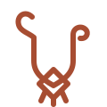
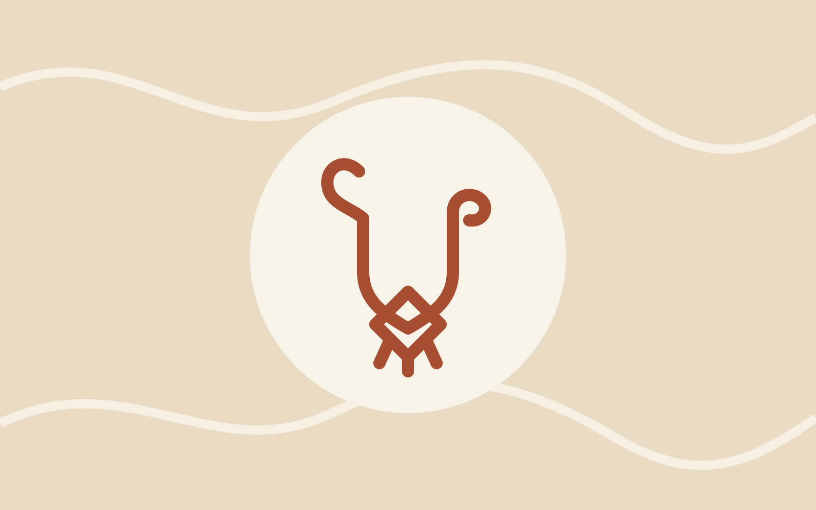
Hebra is the Spanish word for a single thread or strand. Our emblem begins as one uninterrupted line because every woven piece begins in the same modest way: with a thread, a pair of hands, and a sequence of patient decisions.
The continuous line also expresses connection. A finished mochila is not defined by one dramatic gesture, but by thousands of small movements held together. We wanted the mark to carry that quiet accumulation rather than look like a generic fashion monogram.
The line becomes a U
The upper shape forms a loose U for Una. It is intentionally open and organic instead of perfectly symmetrical. That softness reflects the slight variation and evidence of the hand that make woven objects feel alive.
Read together, the U and the single line turn our name into a visual idea: Una Hebra—one thread.
A woven diamond and tassel finish
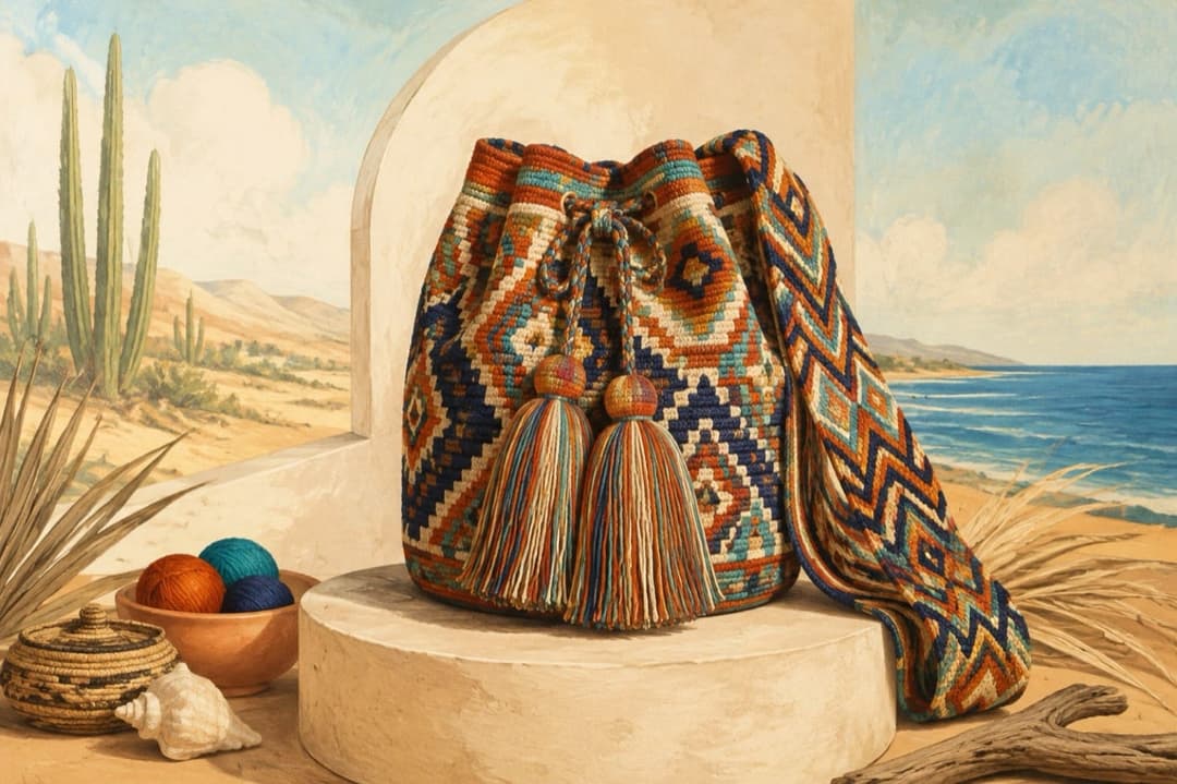
At the base of the mark, the line passes through a simple diamond construction before ending in three short strands. These details visually reference the geometry, cords, and tassel finishes seen across the bags in our collection.
The diamond is a brand-designed abstraction. We do not assign it a traditional name, spiritual story, or fixed cultural meaning. Its role in the logo is to communicate weaving and construction without pretending to reproduce a specific documented motif.
What the logo does not claim
The Una Hebra emblem is not a traditional Wayuu symbol, clan mark, or Indigenous certification. It was created for our brand and is inspired by the visible structure and finishing details of the pieces we carry.
That distinction matters. Admiration should not become ownership. We recognize the Wayuu people as the originators and cultural stewards of their weaving tradition, and we do not present our commercial identity as Wayuu cultural authority.
A reminder of how we want to work
For us, the mark is a daily instruction: begin with the source, credit the culture, respect the work, and tell the truth. Its meaning depends less on what we say about it than on whether our sourcing, product descriptions, and future decisions live up to those words.
One thread looks delicate on its own. Joined carefully with others, it becomes useful, expressive, and enduring. That transformation is the idea we chose to carry in our name and our logo.
QUICK ANSWERS
Frequently asked questions
Is the Una Hebra logo a traditional Wayuu symbol?
No. It is an Una Hebra brand design inspired by a continuous thread, woven geometry, cords, and tassel details. It is not a traditional Wayuu symbol or clan mark.
Why does the logo look like a U?
The continuous line forms a loose U for Una, connecting the brand name with hebra, the Spanish word for a single thread or strand.
What does the diamond in the logo mean?
The diamond is a brand-designed abstraction representing weaving, pattern, and construction. Una Hebra does not assign it a traditional Indigenous meaning.
Learn more
References and related reading for this article: